Jumbleberry
The Results
“By far the best team I’ve ever worked with. They truly understood the look I was going for and completely nailed it!”
Redesigning a campaign management platform.
Jumbleberry’s campaign management tool was deep and confusing. Users circumvented it by calling an account manager directly.
Papaya was brought in to simplify the tool, and find a design solution that would help reduce account management’s time spent on the phone.
37
Reduction in Call Volume
Where we started
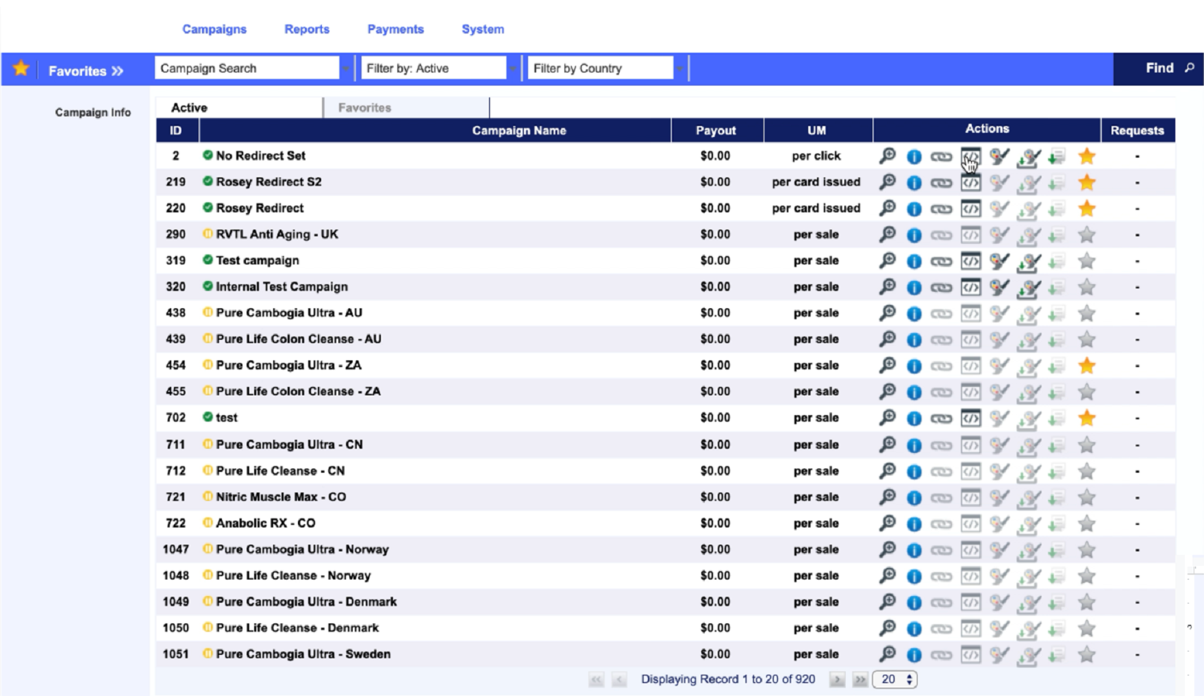
HitPath is a legacy software designed with the best intention of its era. The challenges it had were predominantly found in information architecture and navigation.
How we finished
We reviewed the pain points and business goals of jumbleberry, and brought them together to allow users to navigate campaigns and chat with agents easier.

Where we focused
When diving deep into the research, there were 3 distinct challenges that surfaced.
There were 2 major user groups that we had to focus on. The ‘Campaign’ and ‘Pipeline’ users which made up the focused single users, and the diverse multi-threaded user.
We found that figuring out where to go created a sense of navigation fatigue. Finding what you needed was often hidden behind layered menus, and it needed to be more accessible.
And finally, there was a problem with defaulting to calling campaign agents. Often, users would get stuck navigating hitpath, and default to calling the account team to manage their campaign. We had to help reduce those calls.

Focus No. 1
Campaign Navigation
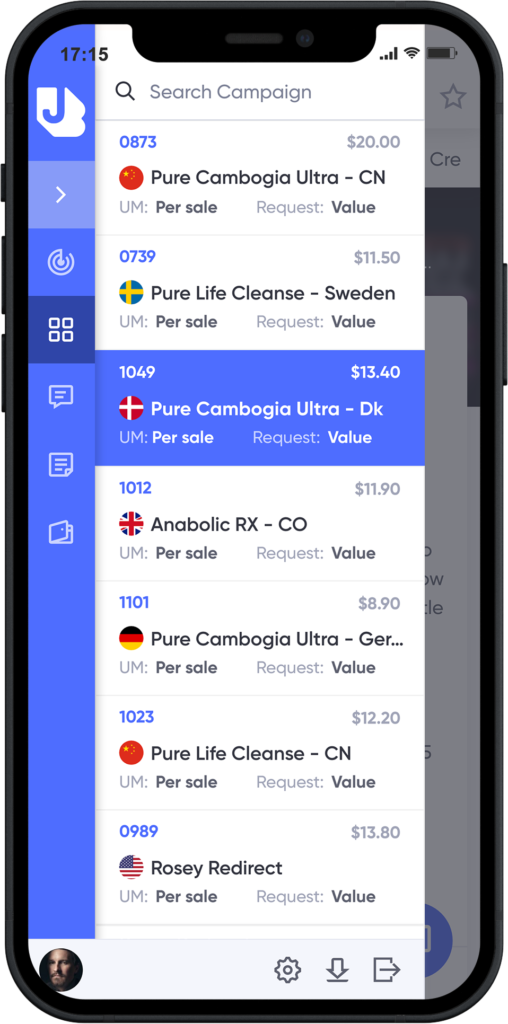
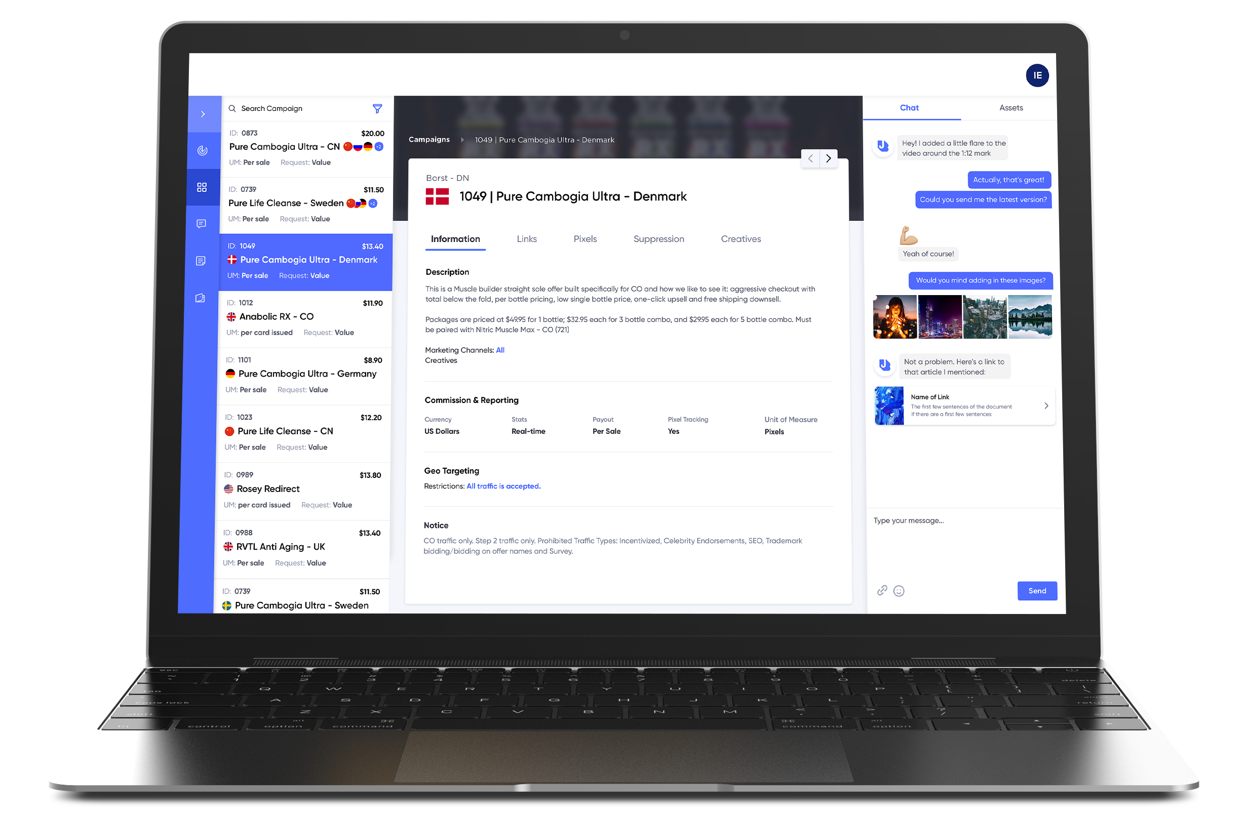
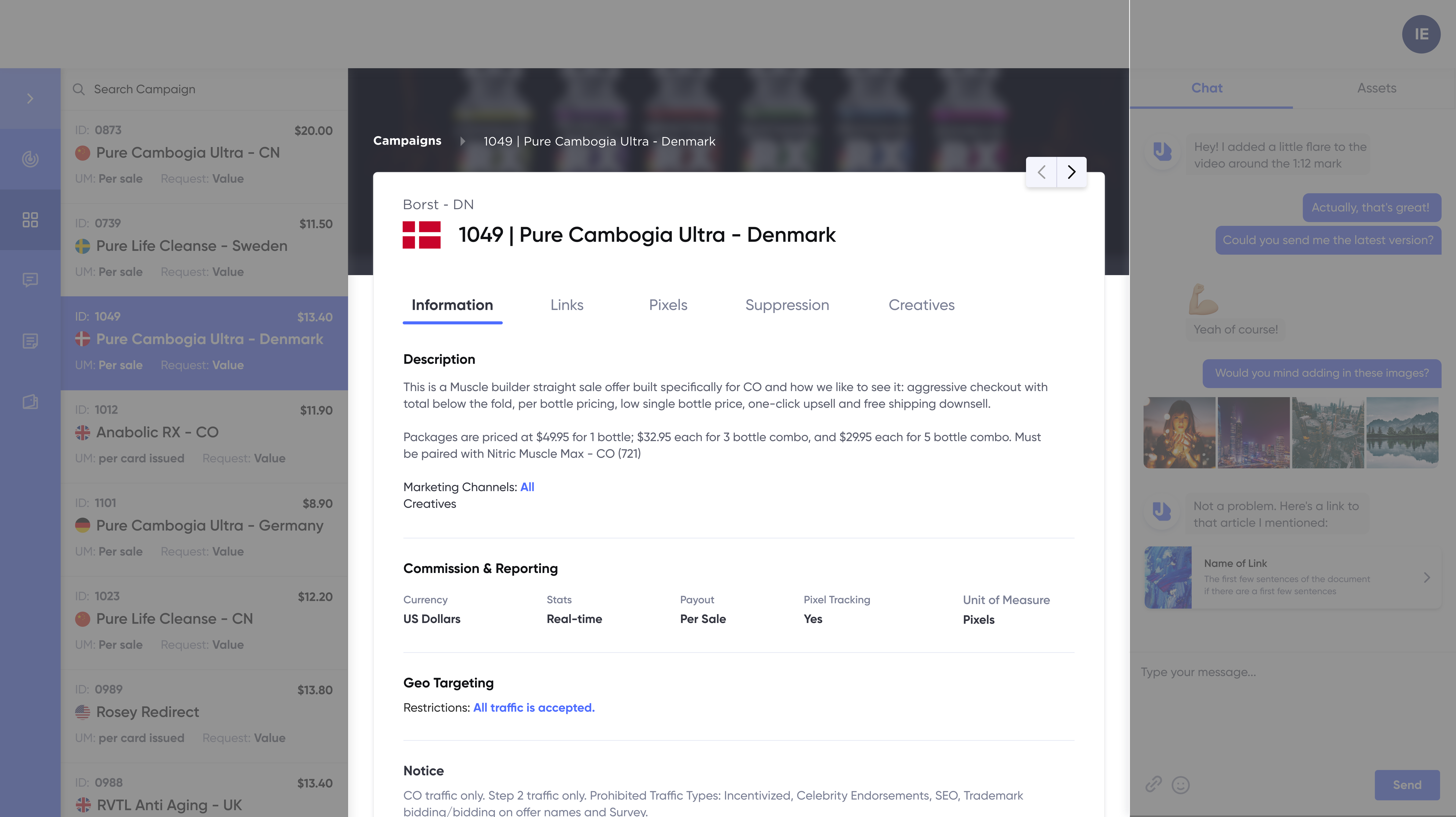
To address the two major user groups and navigation fatigue, we implemented a familiar email or instant messaging pattern. Having the campaigns on the left allows switching between campaigns to be incredibly easy.
Focus No. 2
Single Actionable Area
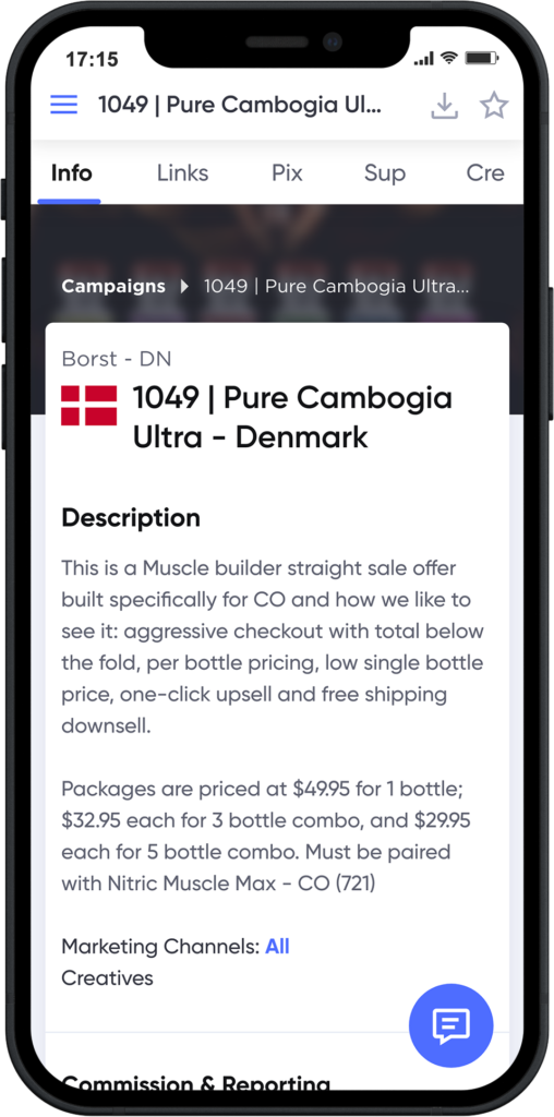
When switching campaigns, users can leverage all client information in the same actionable area to reduce cognitive load.
Focus No. 3
Chat
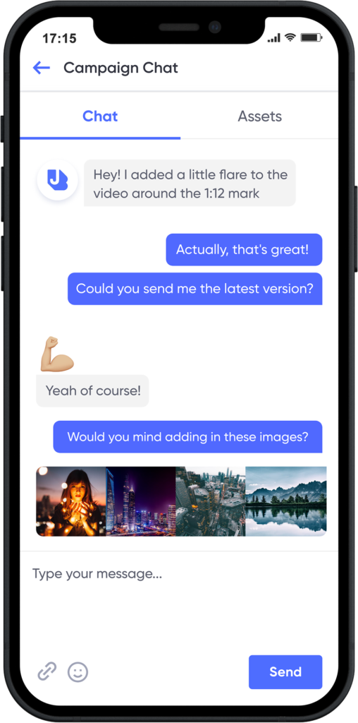
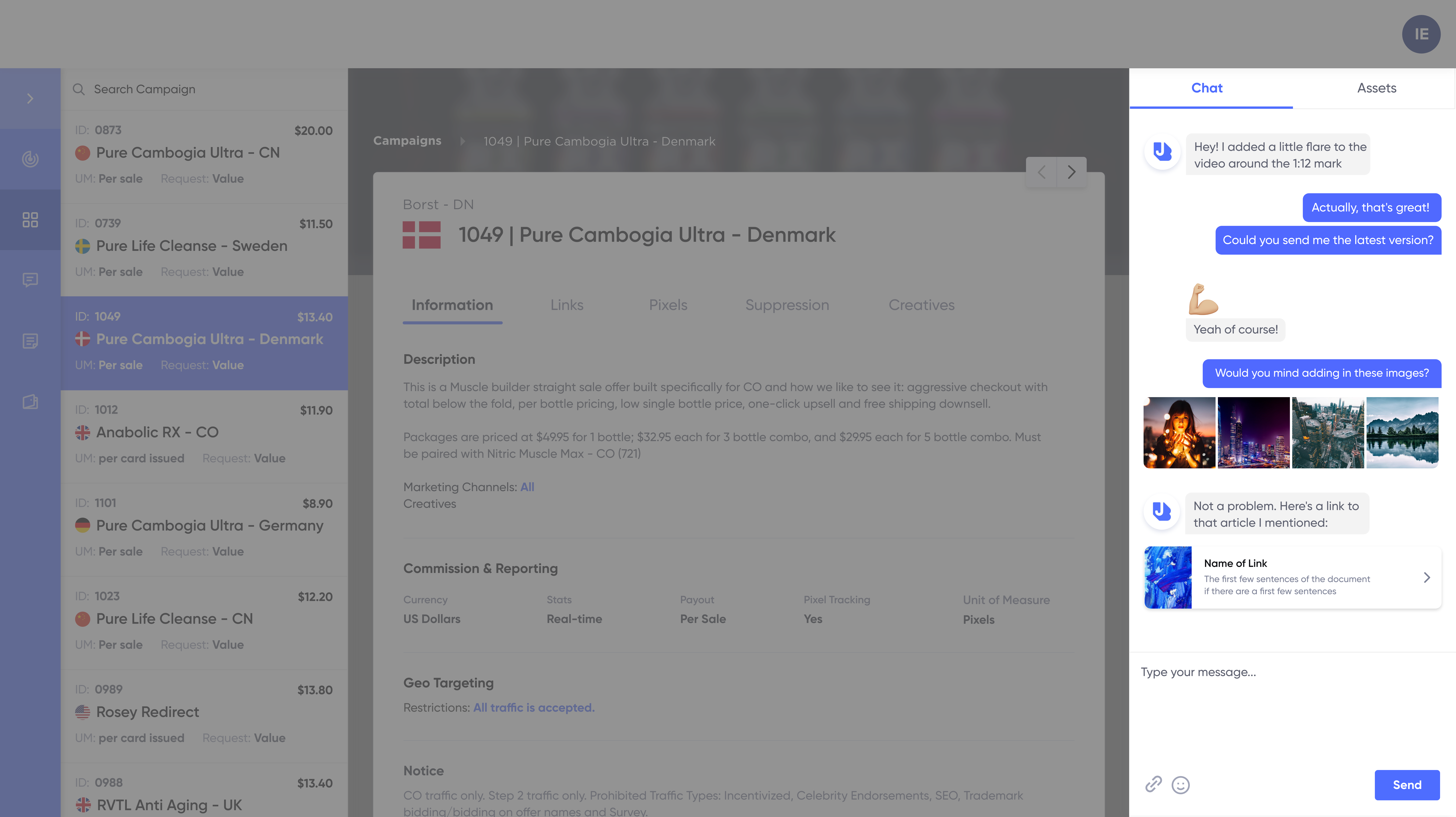
To help alleviate the call volume we implemented chat, allowing you to get in touch with your account agent anytime, and toggle between the conversation and the files sent between each other.
We mirrored all of this on mobile
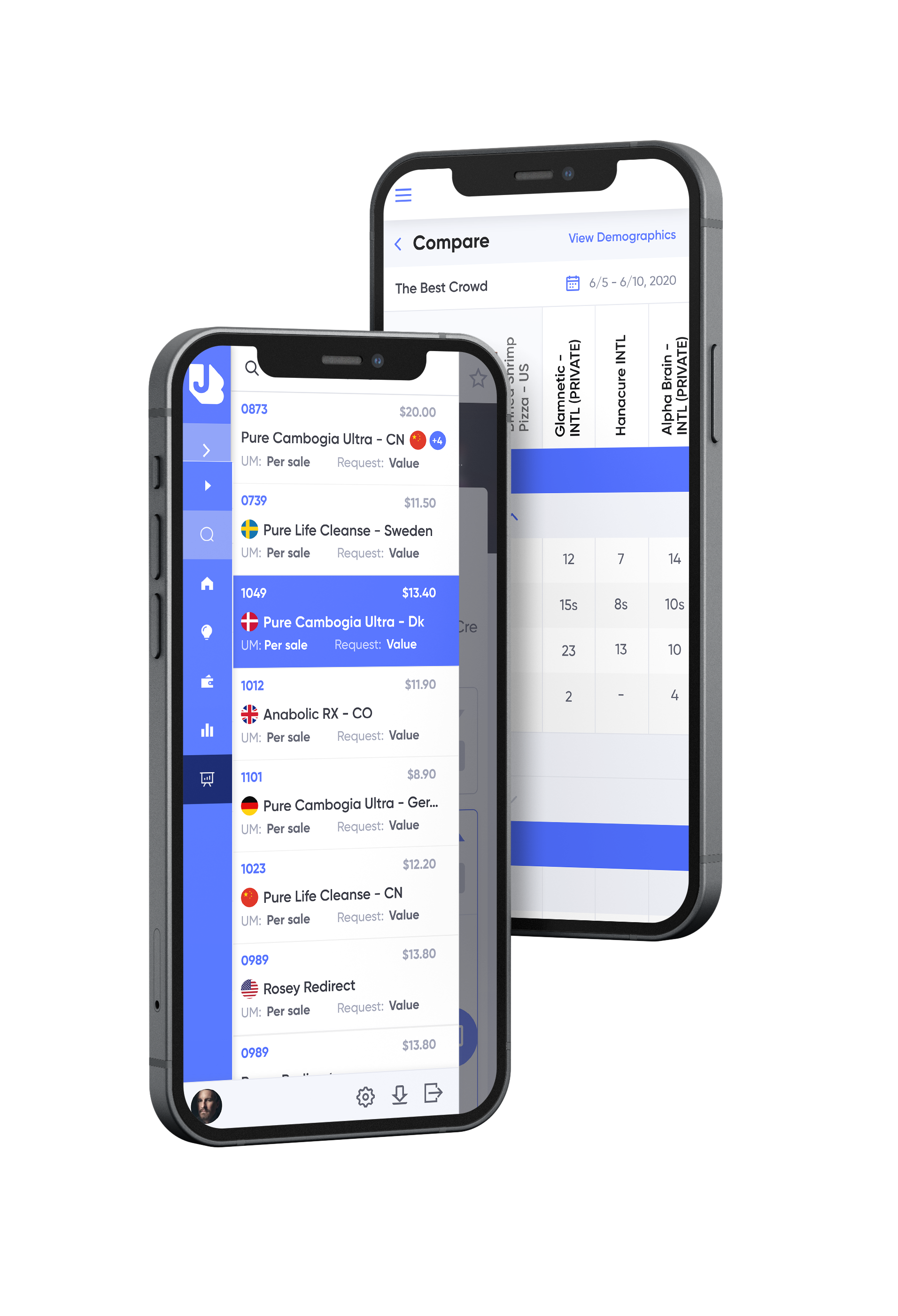
In order to bring the experience cross-platform, we made sure that the mobile experience mirrored the desktop experience, from the navigation to chat.
The Outcome
The updates were well received, with users navigating the software much easier. They now prefer using chat, which reduced call volume by 37% overall. Having their customer feel empowered to make their own decisions was a huge win for jumbleberry, and we have since worked with them on 2 other applications.

